The discourse over anthropogenic global warming (AGW or how human fossil fuel CO2 emissions warm the planet) has now become so politicized and polarized, it’s difficult to even imagine an even-handed, open discussion about the topic. As an earth scientist – a geologist – I like to believe that given the facts, most people with average common sense would be able to figure out for themselves what is real and what is hyperbole. Turns out I may be wrong.
With that discouraging thought, I turned once more to the data to determine what, if anything, could be used to convince true believers in AGW that they just may possibly be wrong and that human-derived CO2 maybe, just maybe, is not as significant or serious a factor in AGW as they might wish to believe.
But, before we start to examine data, let’s acknowledge a couple of things. First of all, nobody is going to successfully argue that the earth’s climate does not change. Our planet’s climate changes constantly and we have ample evidence in the geologic record of significant changes both in temperature and in composition of the atmosphere over time. For example, most people accept that about 12,000 years ago the planet was coming out of one of the periodic episodes of cool temperatures referred to as an “ice age”. The North American continent was covered in ice to south of the present US-Canada border and the alpine glaciers in our Rocky Mountains are remnants of that. Since then, global temperatures have been slowly warming (we aren’t certain of the cause of that, either) until we find ourselves in the quite comfortable situation we’re in now. It is highly probable that, at some time in the future, another ice age will occur.
Secondly, it is also accepted that we are in a period of gently rising global temperatures. By best estimates, global temperatures have increased a little over 1°C over the past 150 years or so, ever since an anomalously cool period referred to as the Little Ice Age when rivers froze over in Europe, crops failed and life was generally miserable for most people for an extended period.
With those two points off the table, let’s get to the matter at hand – what might we find in data to support – or not – the AGW theory.
There are many factors to consider in this discussion. What began as a warning about “global warming” (or “global cooling” if you go back to the late 1970s) morphed into warnings about “climate change” when global temperatures stopped rising in about 2001-2002 in spite of ever-increasing fossil fuel CO2 emissions. At that point, the term “climate change” came to mean that any weather anomaly or condition could be blamed on fossil fuel CO2 emissions. People pushing the climate scare then claimed that droughts, lower snow fall, greater snow fall, hurricanes, tornadoes, forest fires, etc. were all a result of increasing fossil fuel CO2 emissions. When “climate change” seemed to lose its media punch, we were introduced to “climate crisis” and now we’re into “climate emergency”.
So, if we really and truly are into a “climate emergency” due to fossil fuel CO2 emissions there should be some overwhelming evidence for it. Otherwise, why try to destroy our energy industry and potentially our whole economy on the back of the AGW theory?
Well, we do have quite a lot of data on all of the phenomena that the folks promoting the AGW theory like to bring up. First of all – temperature. We really do have a lot of data on this subject, although much of it does not span the length of time that is required to get a good handle on long term temperature trends. Obviously, the longer a period of time a data set covers, the better the picture of temperature trends.
Probably the longest continuous set of temperature data available is the Central England Temperature set and it has collected temperature data from 1660 to the present time. It is represented on the graphs below:
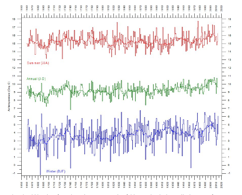
What should be clear from these data are a couple of things. First is the cyclical nature of temperature over temporal periods of 5 to 10 years. Some periods show temperatures increasing, some show temperatures decreasing. Second is the gentle rising trend over the full time interval of the graphs. As mentioned earlier, there has been a gentle, overall trend to increasing temperature of about 1°C over the past 150 years or so. It would appear that there is nothing in these data to suggest a “climate emergency”. Just cyclical ups and downs in temperature with a gentle trend upwards since the Little ice Age.
We have been collecting temperature data via satellites since about 1979 and you can see the data from one of the main data sets in the graph below. What stands out in these data are the very strong El Niño temperature peaks in 1998-1999 and again in 2016-2017 (red arrows). Another feature is the so-called temperature “hiatus” from about 2001 through about 2015 (green line).

This flattening in the temperature trend over almost 15 years has caused a great deal of consternation among those people pushing the AGW theory because fossil fuel CO2 emissions have been increasing steadily as shown on the graph below. According to the data, fully 30% of all fossil fuel CO2 emissions produced by human activities since about 1800 have been produced after 2000. And, according to the most recent WMO data, human-derived CO2 emissions continue to increase. So, this begs the question – if fossil fuel CO2 emissions are causing global warming and about one third of those have been produced since 2000, why did global temperatures not climb?
Incidentally, you’ll notice that the satellite data are shown in tenths of a degree Celsius. The reason for doing this is because if temperature data were given as actual temperature, the variations would be virtually unnoticeable. The graph below the CO2 accumulation chart shows actual temperature data for the planet.


The last temperature graph I’d like to include is for average measured temperature for all US Historical Climatology Network stations. These measurements go all the way back to about 1870 and some features stand out. First is the rise in temperature from about 1870 to the late 1930s. Following that rise, temperatures slowly trended down to about 1980. It was about that time that some science activists began the “global cooling” alarm. Then temperatures began to rise once more, initiating the current “global warming”, “climate change”, etc. alarm. As pointed out earlier, temperatures then paused into what is referred to as the “hiatus”. As the data point out, temperatures now are very similar to those experienced in the late 1930s. And, now, some climate scientists are warning that we may be headed into a cooling period.

Okay – so we are left with a bit of a conundrum concerning global temperatures. If increasing human-derived CO2 emissions are supposed to increase global temperatures but global temperatures are; (1) fluctuating on a fairly regular basis over decadal periods, and (2) global temperatures have only been slowly increasing by about 1°C over the past 150 years or so, how can we justify all the hoopla and hysteria about a “climate emergency”?
Well, how about hurricanes? Do increasing fossil fuel CO2 emissions cause increasing numbers of hurricanes? Fortunately, we do have a lot of data on hurricanes and some of those are shown on the graph below illustrating landfalling hurricanes in the US since 1931.

Once again, we can see that in spite of increasing human-derived CO2 emissions there were many more landfalling category 3+ hurricanes in the US prior to 1960 than there have been since 2010. We have just finished the 2019 hurricane season for the US and, again, hurricane numbers are down.
So the AGW theory seems to be having a difficult time predicting either global warming or increasing hurricanes. How about snow cover? Will the AGW theory predict more snow or less snow over time? Well, over the past 20 years or so proponents of the theory have predicted that the theory can swing both ways. What do the data tell us? The graph below shows seasonal variation in snow extents for the Northern Hemisphere from 1972 and what does it indicate? In essence, the data tell us that there has been no significant change or trend in areal extent of snow in the Northern Hemisphere during that time period, the time period within which human-derived CO2 emissions have been steadily increasing.

Okay, so global temperature, hurricane and snowfall data appear to be of little use to the AGW folks. How about droughts?
Well, how about drought?
Again, we have quite a bit of data concerning drought, particularly from the US. The graph below shows the Palmer Drought Severity Index ( a measure of dryness using precipitation and temperature data) of the US from 1895 through 2015. These data indicate that there are wet periods and dry periods with no obvious trend during that interval of time. Driest times were between 1930-1940 and 1950-1960. The period through which we’ve seen the most which human-derived CO2 emissions – from about 2000 to present – is fairly neutral.

Forest fires are another big item for the promoters of the AGW theory. It seems from media reporting, the more spectacular the blaze, the more intense the blame on “climate emergency”. Forest fires are a tragedy and the cost in human loss as well as wildlife refuge loss and destruction can be heart-breaking. But are human-derived CO2 emissions really to blame?
Once again, we have plenty of data to look at. Below is a graph that shows burn acreage in the US from 1926 through 2018. As can be readily seen, from a high in 1930 to about 1960, forest fire burn acreage dropped dramatically. From then the trend has been flat with somewhat of a slight upward trend from about 1998 but nothing approaching earlier years. And, looking at the number of fires, shown on the next graph, the trend over the past 10 years has been down.
So, on the basis of hard data, it does not appear that there is any “climate emergency” using forest fires as evidence.


Sea level rise is another metric that AGW theory proponents like to use to cause alarm. “We’re going to drown!”, “We’re losing islands!”. However, we do know that warming oceans will rise and we also know, as discussed above, that there has been a gentle warming for the past 150 years or so. So, what do the data have to tell us?
Below is a chart that combines data from tide gauges from all over the world since 1880. What do we see? A slow but steady increase in sea level rise of about 0.5 inches/decade up to about 1950. After that, we see a modest increase in the trend of about 0.3 inches/decade. While the discussion is still in progress, it is possible to argue that human activity might, just might, be responsible for the increase. However, if this trend continues, it will amount to about 8 inches in 100 years, of which humans may, just may, account for about 3 inches in those 100 years. Again, is this an emergency?

Next, let’s take a quick look at temperatures and sea ice extents in the Arctic. The temperature anomaly record below for the Arctic regions is from the Hadley Centre of the UK Met Office and the Climatic Research Unit (CRU) of the University of East Anglia. What it shows is that temperatures in the 1940s were similar to current temperatures. There was a cooling trend from the 1940s to the 1970s followed by a warming trend to the present day. Did human-derived CO2 emissions cause this latest warming? If so, what caused the warming trend from the 1920s to the 1940s and what caused the cooling trend through the 1970s?

And ice extents for the northern seas – what records do we have for those? Until the advent of satellite coverage, we did have aerial photographs and, earlier still, we had navigators’ notes from the vessels that plied the northern oceans. What we know is that ice extents varied a lot, with some seasons with less ice and some with more. Into the era of satellites, starting in 1979, we noted that we were in a period of decreasing ice extents. This fit well with the AGW theory that increasing CO2 emissions were causing ice loss. However, around 2007-2008 something changed and ice extents have held steady as can be seen in the graph below (yellow line). CO2 emissions kept increasing but sea ice extents no longer decreased. How does that square with the AGW theory?

Finally, in spite of all the shouting, vitriol and rhetoric over climate, humans appear to be doing quite well thanks largely to the availability of plentiful, affordable fossil fuels. In just about any metric you’d care to name – life expectancy, poverty, GDP, food production, etc. – the world has improved significantly over the past 100 years thanks to increased use of fossil fuels.
The first graph below illustrates how dramatically climate-related deaths have dropped over the past one hundred years or so. The following graphs show equally dramatic increases in crop production over the past decades, mainly due to increased use of fertilizers and pesticides but also to genetically-modified foods.

So when we take a deep breath, pause and think about it, is there anything in the charts above to suggest that we are in the middle of, or even approaching, a “climate crisis” or a “climate emergency”? I don’t think there is and I’d like to believe that most people, using logic and common sense, wouldn’t think so either.
How do we then square all the furor and hysteria we’re seeing now with the lack of proof that AGW is a real crisis or emergency? Are people not being informed? Are they not given adequate information? Is any open discussion on the climate issue such a toxic idea that the promoters of the AGW theory can actually threaten violence to prevent it? This actually happened recently in Germany when a climate conference featuring over 200 climate researchers had to find a new venue when the centre they had booked decided, under threat of violent protest, to abandon the pre-booked venue. The climate scientists were presenting research papers on factors impacting climate other than human-derived CO2 emissions.
I’m not sure where this is going to end, but we must be getting close to an end point when whole industries, for example Canada’s oil sands, and economies are threatened because of hysteria.
Compiled and written by:
H.R. Bullis
December, 2019
Edmonton, Alberta

This is the single most comprehensive, incisive and convincing exmination of the climate-emergency hysteria.
Unfortunately it was published in 2009, yet here we are in 2020 and still hearing the raised, histrionic voices of the Greta Thunbergs and Ocasio-Cortes’s of the world.
There seems little evidence that human beings – en masse — are really a rational species.
Excellent summary. I just hope that people who have limited backgrounds in science or math are not going to tune out when they start seeing your charts.
Andrew:
Even the first few charts tell the tale. Surely anyone vaguely interested in the topic, enough to participate in another demonstration to block traffic (as if that will convince everyone to reject fossil fuels), will get the message.
Or am I being overly optimistic?
The number of people who don’t freeze and flee at the first chart can probably hold a meeting in a small elevator.