by Norm Kalmanovitch, P. Geoph.
The global temperature is determined by the net amount of energy that the Earth receives from the sun because a portion of the sun’s energy is reflected back into space by clouds the atmosphere and the Earth’s surface (called Albedo) reducing the amount of energy that actually contributes to global temperature.
The percentage of energy reflected away is approximately 30% divided among the three components by around 20% from clouds 4% from the rest of the atmosphere and the remaining 6% from the Earth’s surface. The reflection from clouds and the atmosphere remains more or less constant over the course of a year but because of snow cover in the large northern hemisphere landmass the 6% portion of the albedo resulting from reflection from the Earth’s land surface changes dramatically resulting in global land surface temperature measurements changing by over 10°C over the course of a year.
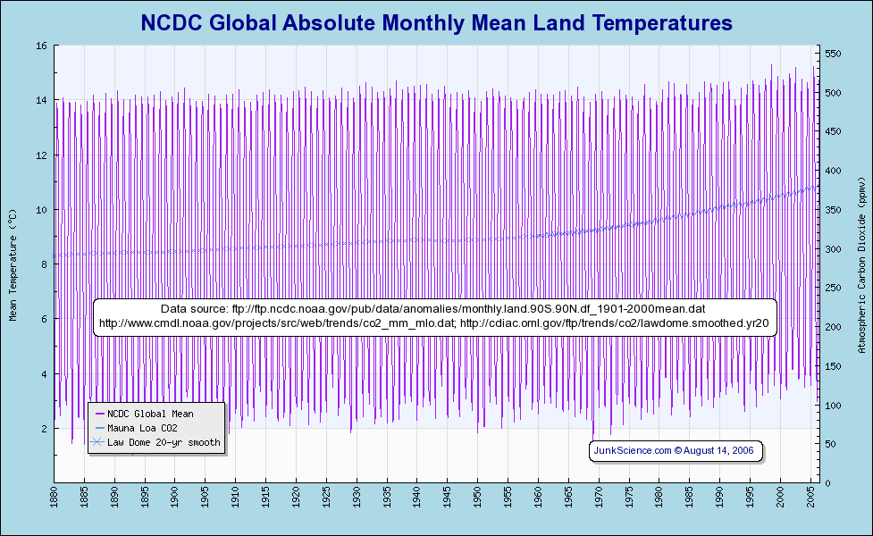
The oceans are not affected to the same extent so when temperatures over the oceans are added the global temperature range is reduced to around 3.9°C over the course of a year.

Global temperature change has averaged around 0.6°C/century so detecting this rate of change on a year to year basis would require doing the impossible and identifying a 0.006°C temperature change against a 3.9000°C background. To get around this problem, monthly temperatures derived as the average 24hr daily temperatures over the month is subtracted from a long term average temperature for that month and the difference is displayed as a global temperature anomaly value for that month.
The accuracy and precision of these monthly global temperature anomaly values is dependent on the accuracy and precision of both the land surface measurements and the measurements over the oceans as well as the uniformity of the grid over which they are measured.
Land surface measurements suffer from the sampling bias of having more weather stations in densely populated urban areas than less populated rural areas and very few stations in isolated remote wilderness areas. In addition to this as cities grow their average temperature increases and with these warmer temperatures in urban areas called urban heat island effect; land surface measurements are biased towards warmer temperatures. These biases have been well, but not perfectly, addressed with the application of corrections resulting in land surface based temperature values consistently higher than values derived from satellite measurement.
The biggest changes to the overall global temperature occur from changes in the ocean surface temperatures and the resulting changes to the air temperature above the oceans.
Air temperatures over oceans are measured by sparsely spaced weather stations, measurements made by ships and sea surface temperatures provided by the Argo Buoy measurements. These provide enough data for temperature mapping on a 5° x 5° grid representing 500km by 500km grids each with an area of 250,000km2 .
The area of the oceans is 361,132,000km2 so ocean measurements are limited to just 1445 grid points as demonstrated by the 1444 large grid squares in this map of ocean temperatures:
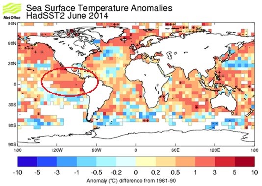
Any surface warming resulting from ocean currents less than 500km wide will not be accurately measured severely detracting from the global temperature measurement. The highlighted area is where the current el Niño formed and with this coarse grid it is not possible to accurately measure the influence that el Niño conditions have on global temperature.
Satellites on the other hand measure on a 0.5° x 0.5° grid of 50km by 50km with a grid area of just 2500km2 providing 144,400 evenly spaced grid points over the Earth’s ocean surface improving the resolution by a factor of 100.
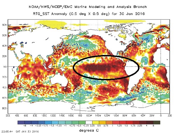
The highlighted area is the current January 2016 el Niño conditions precisely mapped by satellite data in a way that the coarse grid of surface based measurements are not able to achieve.
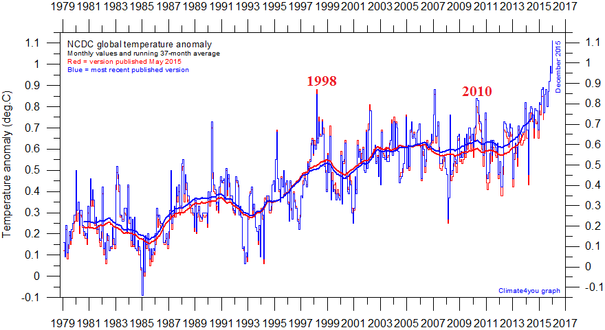
The difference between satellite measurement and the surface based measurement is clearly evidenced by the way the 1998 and 2010 el Niño conditions are represented on the satellite and NCDC surface based global temperature datasets.

The satellite measurement of sea surface temperature is described here
http://polar.ncep.noaa.gov/sst/oper/Welcome.html
It is rather curious that NOAA’s NCDC dataset does not use this SST data.
~~~~
Technical people tend to write articles for other technical people in their discipline. If one wishes to explain something so that reasonably well-educated other people can understand the article please write for those kind of people. In the above article:
• Graphs are presented to make a point but the reader is left to try to understand what the graph shows. Only the cognicenti will understand. After the graph there should be an explanation of what the graph shows and its significance. For example, “The above graph shows that…”. The points made following the graphs in the article don’t even need the graphs themselves.
• Abbreviations are used which most people will not understand. Best to avoid arcane abbreviations such as NOAA, NCDC and SST. If abbreviations must be used follow the convention of spelling it out after first use. As an engineer I know what NOAA stands for, assume SST is something about satellites but have no clue what NCDC stands for.
If people with a scientific background have difficulty understanding an article such as this what chance have well-educated but non-technical people? Yet, it is the latter group for whom articles such as this one should be written; otherwise, what’s the point of writing it?
Points well taken. We are caught between two worlds. When we make simplified explanations, some people say “Oh, that’s not scientific enough” – when we make scientific explanations people say “No one ordinary citizen can understand that.” We will pass on your comments to the writer and editor – many points well taken.
Nevertheless the article was very informative and I definitely got the gist of the conclusion that satellite data provide better measurements of climate data than surface measurements. And more importantly that surface measurements do not take into account ocean surfaces and other variables like the ‘urban heat island effect’. Great article.